THE PROBLEM:
The California DMV app strives to be a “one-stop mobile directory,” but the interface currently falls short of being user friendly. Only about 20% of license renewals and 36% of vehicle registrations are currently done online through the app or website. Our team evaluated the CA DMV app with an expert inspection, two contextual inquiries, and analysis of similar products. To conclude the first half of this project, we documented and presented a list of accessibility and usability improvements to make the app easier to learn, easier to use, and more visually appealing.
This project was coursework for SJSU’s ISE217: Human-Computer Interaction, Fall 2020.
CA DMV
The current version of the CA DMV app gives users access to many online transactions. Although the home menu has been minimized for mobile use, navigating the app is frustrating, and users would rather use the desktop website or go to a field office.
MY ROLE:
Researcher & Project Team Leader
As team lead, I built a schedule and shared documents for our team of four to collaborate and meet internal deadlines. In addition to work on the product evaluation and prototype, my main contributions to the project focused on setting the usability metrics and designing contextual inquiries to collect qualitative and quantitative data, conducting a comparative analysis of a similar product (the D.C. DMV app), and designing the final poster. The results of the redesigned prototype are presented in our project presentation, California DMV App: Usability Evaluation & Redesign.
Contextual inquiry:
We conducted three inquiry methods to obtain a baseline for how easily users are able to learn and navigate the app:
User Interviews: Users said they most value simplicity, ease of use, mobility, and personalization when dealing with mobile apps. Half of the participants mentioned that in person tasks (going to a field office) took a lot of time to complete, and all expressed interest in access to features that are already available through the app (first-time users).
Open Card Sort: The most common groupings were Vehicle Registration (6 participants), followed by Personal Info/Account, Driver’s License & ID, and Driver Tests (5), and Payment & Refunds (4).
Figure 1: Open Card Sort
Usability Testing: Users were able to complete tasks fairly quickly (Figure 2), however most expressed frustration with the application during navigation. In cases when users got lost or did not know how to go back, several noted the lack of a back button either in the app interface or the OS itself; four participants said that an attempt to go back one screen did not take them where they expected to go.
Out of a total of 30 tasks (6 participants, 5 tasks each), 3 tasks were not completed, for an abandonment rate of 10%.
Figure 2: Usability Testing, time to complete various task flows
In rating the app’s overall experience, the average score was 2.3 out of 5, with the majority of participants saying they would just use the website rather than downloading an app.
Comparative Analysis:
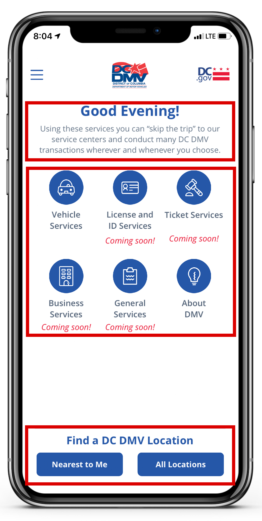
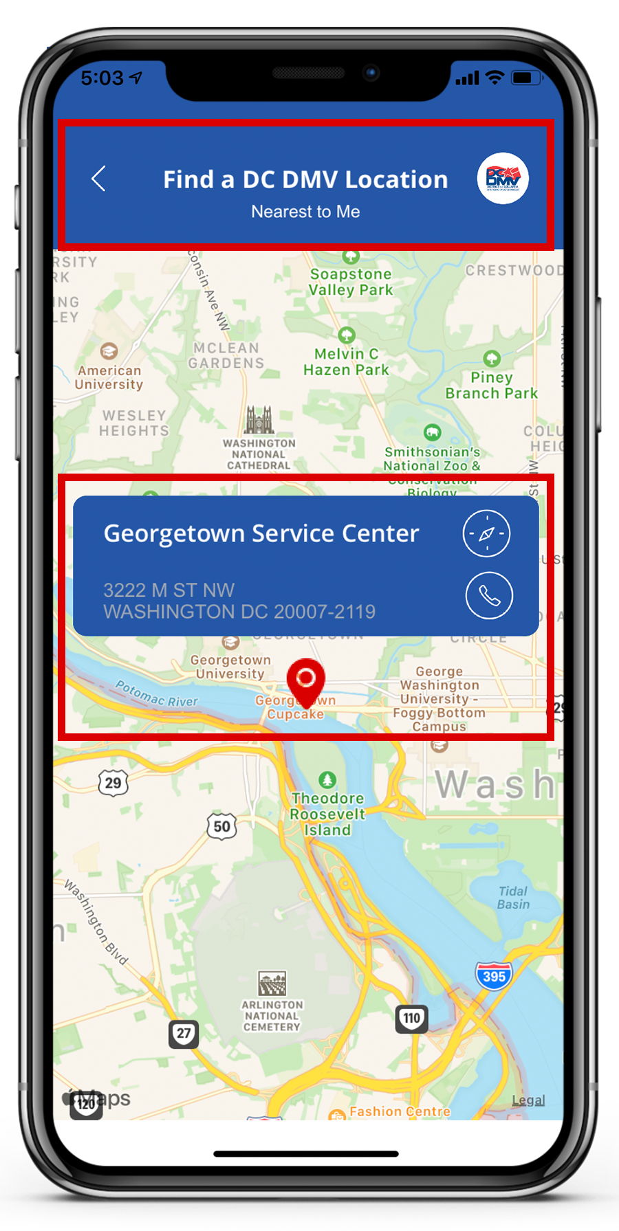
There is no direct competitor to the CA DMV app, so I evaluated a similar DMV app from the District of Columbia. As shown in the gallery below, the choice of main features were a better conceptual match to user goals, the app capitalized on familiar language and icons, and navigation indicators were present and consistent throughout.
RECOMMENDATIONS:
Redesigning the navigation and most common task flows will make the app more efficient and satisfying to use, and could help to increase the percentage of license and registration renewals completed online instead of in a field office. This shift would increase health and safety during the coronavirus pandemic, and could create cost savings by reducing staffing needs for in-person services.
Based on our evaluation, we recommended several design improvements, including the following high-impact changes:
Restructure the information architecture to match the most common user goals
Add a search bar to the Home page
Add persistent “back” and “home” buttons to support navigability
Increase text/icon size and contrast to increase readability
Increase touch target size, salience of navigational elements
Use familiar, task-based language instead of DMV jargon
Prototype design:
We built our redesigned prototype on Axure, according to a short list of product requirements and recommended design improvements. A selection of screenshots is included below:
user testing:
To compare our redesigned prototype to the existing DMV app, we repeated the usability tests from Phase 1. Our results showed a statistically significant reduction in the time required to complete each task, and an increase in the overall user satisfaction rating.
Conclusions:
The design changes led to an increase in user efficiency, effectiveness, and satisfaction, and should satisfy all three personas for ease of use, access to critical transactions, and minimalist design for increased visibility. The full results of our user testing and final conclusions are presented in our project poster, California DMV App: Usability Evaluation & Redesign.
wrap up:
What I learned from this project:
The basics of interactive prototype design using Axure
Users’ needs and expectations for mobile apps are different from a desktop website, and responsive web design may not be enough to make the mobile experience effective, efficient, and satisfying to use
Users are quick to abandon a product if it does not meet their expectations, or if they encounter errors too quickly
Not every service/feature needs an app; since mobile capacity is limited, if users will only need something infrequently, they are likely to prefer accessing a website


